
Don’t worry, we’re not referring to the delicious meat, cheese, pickles and ketchup sliders – you should definitely keep enjoying those.
The sliders we’re talking about appear on webpages and are sometimes called “carousels” or “slideshows“. They often appear in the header of a website, and typically include photos and text, and many times will auto-rotate from one slide to the next.

A common slider / carousel / slideshow
Sliders once ruled the web design landscape, but it’s well past time for them to be eliminated from websites, mainly because they create a disappointing user experience. There has been extensive testing by many agencies and organizations to prove this point, and they all point to one conclusion: sliders, carousels, and slideshows are dead.
Need more proof? Here are 6 crucial reasons to ditch sliders for your website.
Sliders Are Invisible To Users = Banner Blindness
You’re thinking, “Wait, what – banner blindness?” Sliders are susceptible to what’s called banner blindness, a phenomenon when people subconsciously learn to ignore content that resembles an advertisement.
When users visit a website they have a particular objective in mind and anything resembling an advertisement gets passed over – both visually and perceptually.
Banner Blindness – users ignore what they perceive as ads
Image from Nielsen Normal Group
Studies prove that most users see sliders as annoying ads, therefore, they automatically ignore them. The layouts and designs of these sliders are similar if not identical to banner ads, which stay in the audience’s blind spot. Banner ads are the background noise of the webpage experience, not something that grabs an audience’s attention and keeps it.
Craig Kistler, founder of the conversion rate optimization firm Strategy & Design Co., has observed user tests with image sliders for more than 15 years and has determined, “In all the testing I have done, homepage carousels are completely ineffective… In test after test the first thing the visitor did when coming to a page with a large carousel is scroll right past it and start looking for triggers that will move them forward with their task.”
Banner blindness strikes again.
Sliders Contribute To Website Traffic Loss
Sliders slow down load times because they use multiple large images, which quickly use up bandwidth. Not only are they slow but they don’t present well and rarely are optimized for mobile website use. So the miniscule arrows or dots that are sometimes visible somewhere on the slider are downright invisible on mobile sites, so navigating the slider is frustrating to the user, assuming the user is attempting to interact with it at all. After all this, the user disappears along with their potential conversion, and they likely won’t be coming back.
Websites need to be fast – Google recently launched an initiative called Core Web Vitals to help promote website speed (and reward those speedy sites with some improved rankings).
Websites lose traffic when it takes significant time to load content. Conversely, sliders typically consist of multiple large images, often increasing page weight by several megabytes. This compounds into a page loading slower, and means that sliders can contribute to a higher bounce rate (bounce rate is the percentage of visitors that leave a webpage without taking an action, such as clicking on a link, filling out a form or making a purchase).
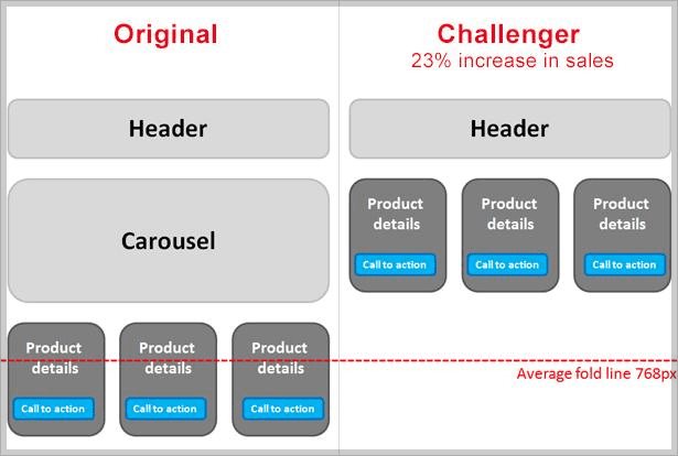
Removing carousels and increasing product visibility
Image from econsultancy
Instead of replacing a slider with a static image, Adobe Optimization Manager, Blair Keen removed the slider entirely, and raised all of the contents below it. He tested this against the version that had the slider (results in table below) and found that the version without a slider resulted in a 23% increase in sales. That’s a large increase in sales from removing the slider.
Sliders Trash Your SEO
As a reminder, SEO (Search Engine Optimization) is the practice of increasing both the quality and quantity of website traffic along with exposure to a brand through non-paid or “organic” search engine results. The following impacts are associated with sliders and their poor SEO:
- Slow site speeds because of multiple large image downloads
- The creation of multiple H1 (heading) tags automatically for each image, which creates problems for search engine rankings because content isn’t following the correct hierarchy for HTML
- Generally not working right or formatting correctly on mobile devices, and
- Could possibly be flash-based and therefore impossible for search engines to read.
Sliders Have Abysmal Engagement Rates
Website sliders have extremely low click-through rates. This means they are not effective when it comes to converting visitors to leads. A study by The University of Notre Dame showed a click-through rate of barely 1%. Additionally, 84% of those clicks were on the first item in the rotation. Audiences simply don’t interact with sliders, and IF they do it’s with the first slide. So what is the benefit of a slider at all?
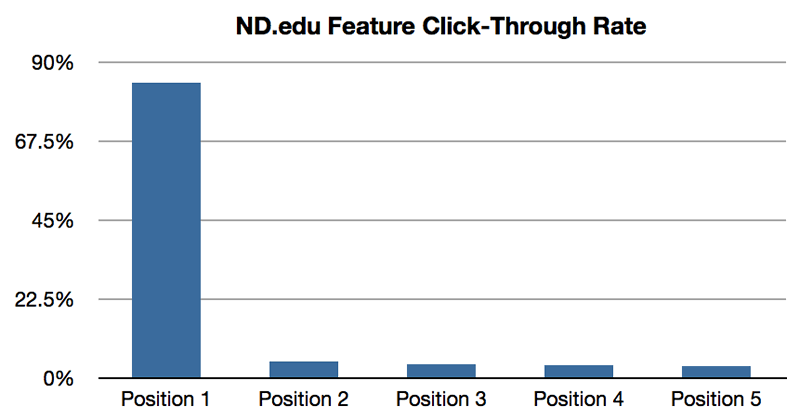
Notre Dame homepage carousel clicks
Image from Erik Runyon.
If you don’t believe us, listen to Karl Gilis, a renowned conversion expert, “Sliders only exist because web designers love them. And because they make the life of the web team easy: they can give every department or product division a place on the homepage. And they don’t have to make choices…But it’s not your job to make your colleagues happy. It’s your job to make your visitors happy. And to sell. And that’s the biggest problem with sliders: they don’t convert. Never did and never will.” We’ve heeded Karl’s advice, and you should too.
Sliders Can Stress Out Customers
Sliders cause an overwhelming website experience. Users are coming to your site to gather information and hopefully interact with your company. Most of the time sliders move so quickly that people aren’t able to read the full message and take action on the information. The user then feels confused and will probably skip to another website, where the information is given to them in a neat, easily understood page.
Avinash Kaushik, Digital Marketing Evangelist for Google agrees, “Sliders please the owner of the site, but they deliver little to no value to the customers. The reason is that we are not going to sit there and wait for your ‘movie’ to play out. I’m also not a fan of sliders because for most businesses they provide an excuse not to think about personalization and being good at giving the customer the right answer, right away.”
The user wants to be in control of their experience, and an auto-flipping slider takes the control away from them. It’s incredibly frustrating when you’re not done reading the first slide and it skips to the next, right? There are simply more effective ways to display information, images and products. We will give you some ideas later.
Sliders Turn Away Some Audiences
Sliders are not accessible to all audiences. Not only do people with vision impairments miss slider navigation but sometimes the sliders malfunction, especially on a mobile site. This is a bigger problem than most realize, even the Department of Justice is working on amending the ADA to ensure an equal user experience for every person. Currently, sliders are not user friendly for audiences with disabilities. For example, most sliders use tiny arrows or bullet points in discreet locations to control the slider. Audiences with vision impairments can’t see these controls (and let’s be honest, neither can anyone else really), not only is that unfair but it’s alienating an audience from interacting with the company.
Alternatives To The Slider Slump
Luckily, there are alternatives to sliders – options like dynamic content any personalization, more prominent/accessible messaging, and the use of video or animations are great alternatives.
Dynamic Content
Dynamic content via personalization is a fantastic option to keep customers engaged. This grabs the audience’s attention and presents them with a clear message that has value to them.
Let’s say that you are a bank, and you have website visitors that interact with a mortgage calculator. Having the website’s homepage replace the original hero image with one centered around home ownership is one great example.
Prominent & Accessible Messaging
Instead of showcasing multiple offers in a slider it’s more effective to highlight one clear message. Even if it’s a static image, it’s accessible. If you don’t love the idea of a static image then use a video or fun animation. These videos and animations should be short and focused with one clear message.
Prominent and accessible messaging is a great way to keep users engaged. Studies show that users are not afraid to scroll vertically, so creating visually appealing content that allows user to scroll and search a page increases many key metrics.
Use Video
Video has incredible engagement rates, and it’s often preferred by website visitors versus reading pages of text. Consider adding a few test videos to a page and record the engagement metrics – you’ll be surprised at how effective videos are.
Sliders Are Dead
Some experts feel strong enough to call them “evil”, including the CEO of Site Turners, Tim Ash “The evil truth of rotating banners is that they do the opposite of what’s intended, distracting users away from your most important content.”
There are so many reasons to get rid of sliders and yet none to keep them. With several alternatives to sliders you should be well equipped to start your journey to a slider-less existence.
But, if you need one more convincing test, here’s a website dedicated solely to the question of Should I Use A Carousel?. We’ll let you be the judge.